TL;DR
In this video I show you how to create live dashboards inside Plannerly's Docs module that pull directly from your model checking tasks. You will see how to add charts, filter by milestone, team, or status, and set up automated weekly PDF reports that get sent to your team without you having to lift a finger.
Watch: How to create and automate dashboards for BIM model checking in Plannerly
Creating a dashboard document
You already have all of your checks running against model elements - you know which ones are good and which ones need attention. The next question is how do you dashboard that progress and share it with others?
It starts in the Docs module. Create a new document, drag it to the front of your document list, and give it a name - something like "Dashboards". Hit save and you are ready to start adding charts.
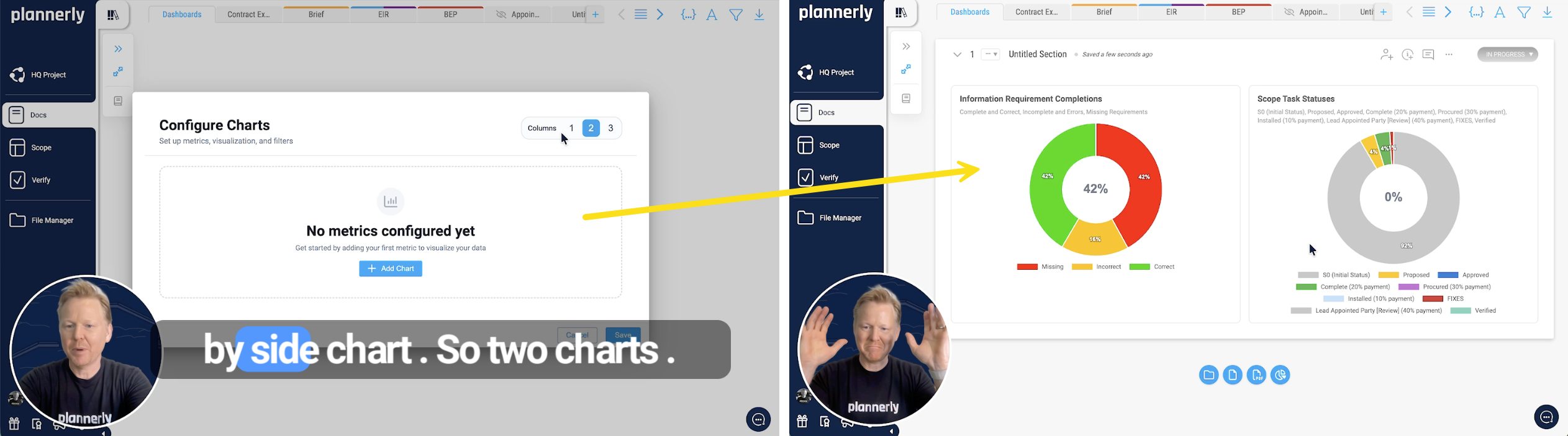
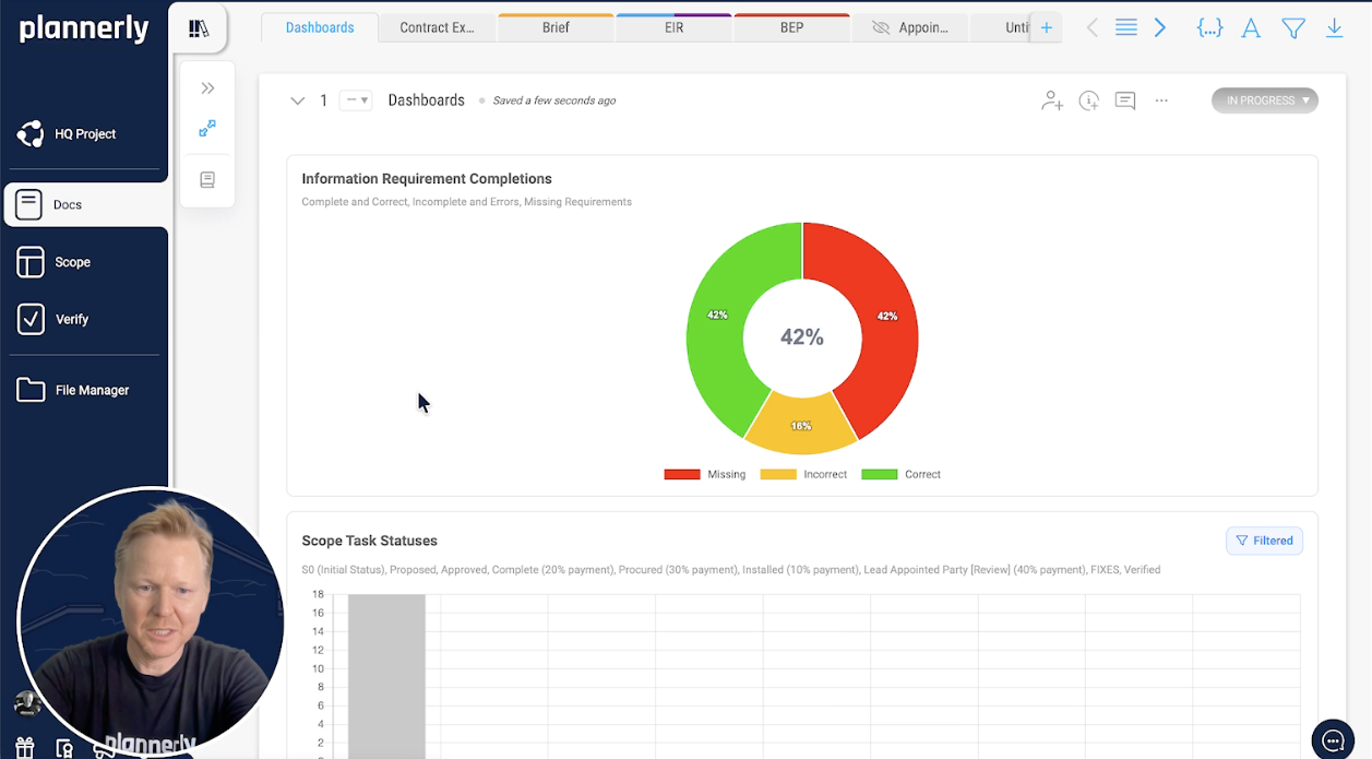
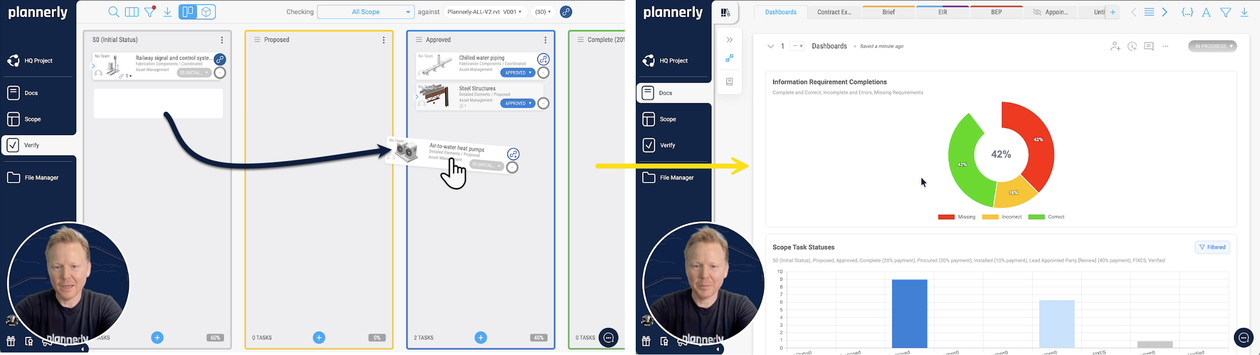
Inside your new document, add a chart block. You can choose a side-by-side layout so two charts sit next to each other - for example, one showing information requirements completion and a second showing task status. That is all it takes to get started.
Choosing chart layouts
Maybe side by side is not quite what you want. You can change the layout so the charts are stacked on top of each other, and you can switch the chart type too - turn the bottom one into a bar chart, for example. It takes seconds.
The point is you are not locked into one view. Rearrange and restyle your charts until the dashboard tells the story you need it to tell. Quick, simple, and completely flexible.
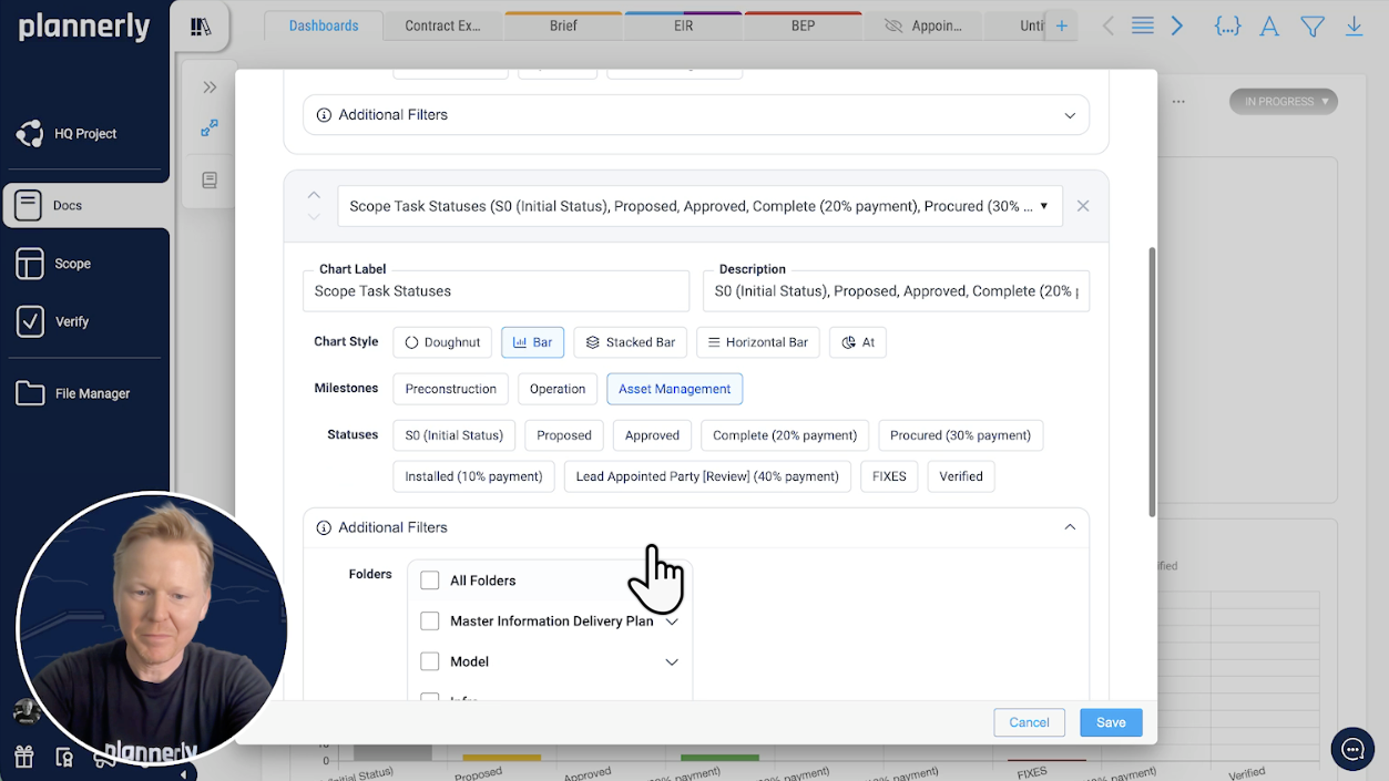
Filtering your dashboards
Dashboards become really powerful when you start filtering. You can narrow down what the charts display by:
- Milestone - focus on a specific delivery gate, for example asset management
- Status - show only completed tasks, or only those still in progress
- Team member - see what a specific person is responsible for
- Team - filter to a discipline like the mechanical engineering team
Once you hit save, the dashboard updates to reflect those filters. This means you can create targeted dashboards for different audiences - one for the project lead showing overall progress, another for a discipline lead showing just their team's status.
Real-time updates from task changes
Here is where it gets really useful. As your team updates tasks - dragging them across the Kanban board, changing statuses, completing deliverables - the dashboard updates automatically.
In the video I switch to the Kanban board, filter for a specific milestone, and start moving tasks into different status columns. When I go back to the dashboard and open it up - boom, it has already updated. No manual refresh, no re-exporting data, no copying numbers into a spreadsheet. The dashboard is always showing the latest state of your tasks.
Exporting and automating reports
You do not have to export to Excel, update a dashboard somewhere else, PDF it, and send it to Teams. It is all automated inside Plannerly.
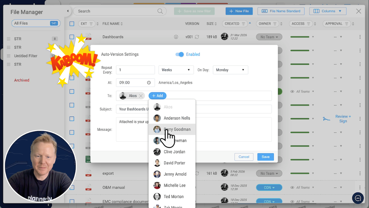
From the dashboard document, create an export file. You can customise what gets included - turn off the table of contents if you do not need it, remove the document ID from the top corner. Save those settings and you have a clean PDF report ready to go.
But the real time-saver is auto-versioning and scheduled delivery. Set it to send on a weekly basis - say Monday mornings at 9 AM - choose your recipients, write a short message, and hit save. From that point on, the dashboard report lands in your team's inbox every single Monday morning without you even having to think about it.