TL;DR
Plannerly's Docs module now lets you filter charts by work package in a single click. Instead of manually setting up filters for every team and folder, you can reuse the scoping structure you've already built and generate filtered, auto-updating charts in seconds.
Watch: How to add filtered charts using work packages inside a project document, with live examples for infrastructure, mechanical scope, and team-specific views.
The problem this solves
I used to spend hours exporting project data into Excel, reformatting it, and then uploading it into tools like Tableau or Power BI just to build a dashboard. And the worst part wasn't the export - it was having to rebuild all the filters again inside the new tool. Teams, folders, custom views. All the scoping work we'd already done, completely redone from scratch.
A lot of people want to see project progress in different ways - filtered by discipline, by team, by work package. But when each of those views requires a manual setup in a separate system, the administrative burden stacks up fast. If somebody's already done the work to define work packages - who's responsible for what, which scope belongs to which team - you should be able to just use that.
How work package filters work
Inside a project's document tab, click Add a chart and choose your chart type - information requirement completions, task status, or scope task status. These charts use linked model elements, which means they pull data directly from your live project structure.
The new part is the Work Packages filter. Instead of manually picking which teams, folders, and members go into each chart, you select a work package in one click. Infrastructure scope, mechanical scope, a specific team like Mega Build - each one is a single selection.
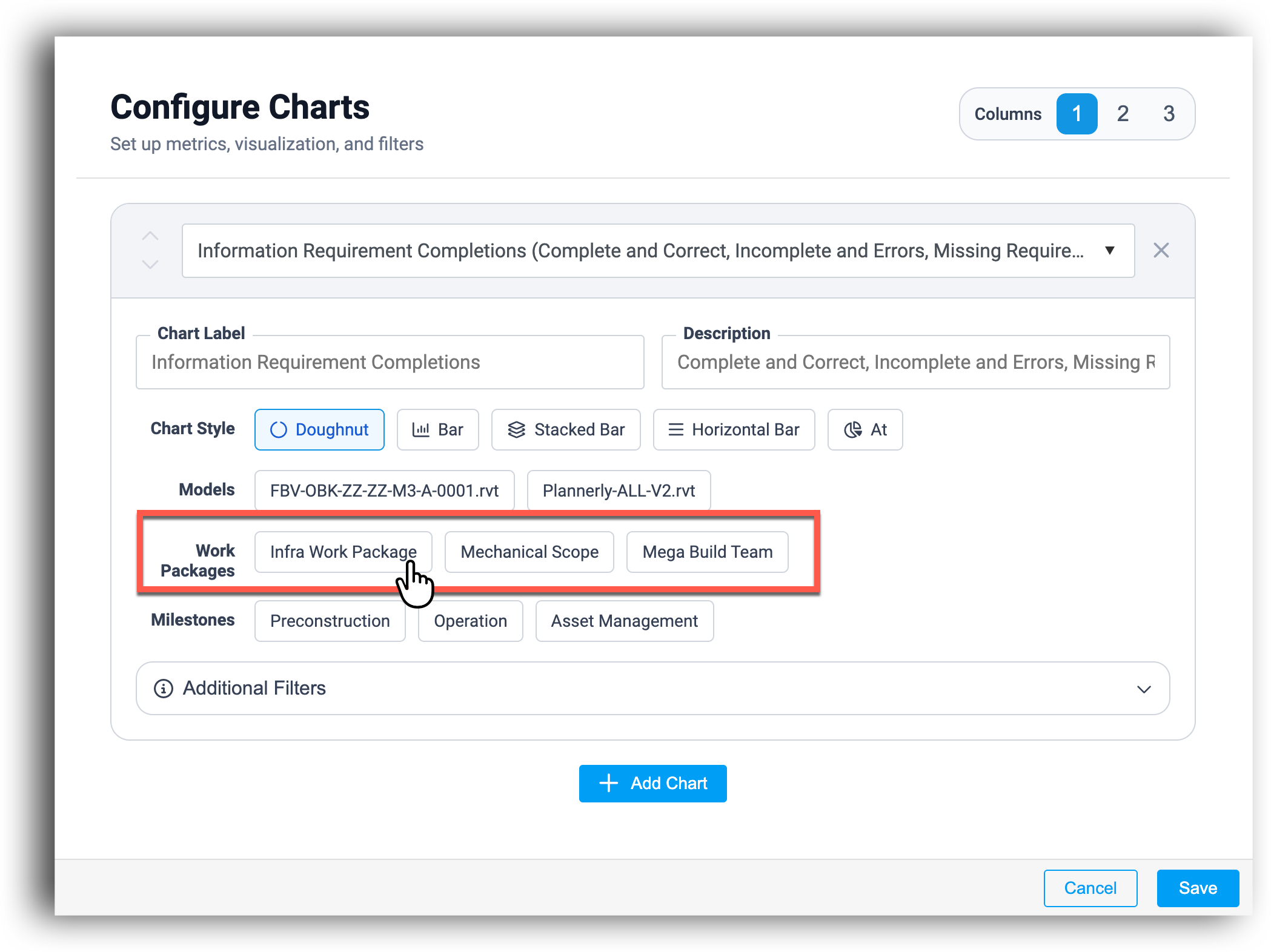
Building multiple filtered charts
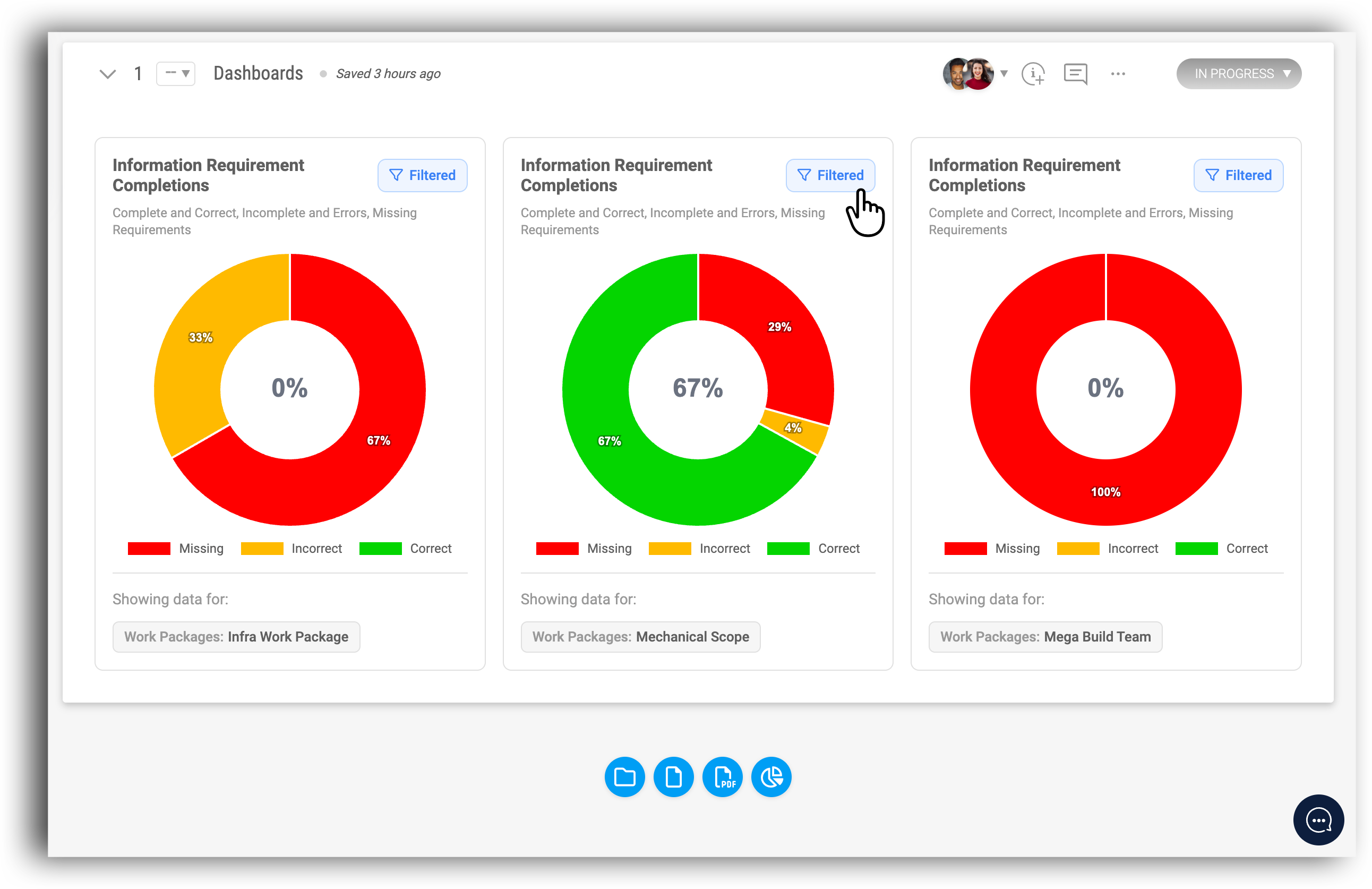
You can define several charts in sequence - one for infrastructure, one for mechanical, one for a specific team - and then save them all at once. Once saved, the charts populate together, each showing the completions and status for its filtered scope.
This is what used to require exporting to Excel, reformatting everything, uploading to Tableau or Power BI, and then rebuilding all of those filters in that tool. Now the whole thing takes about a minute, and you're working with live data the entire time.
Live sync and automatic updates
Because these charts are linked to your actual project model, they stay in sync automatically. As teams complete their information requirements, the charts update to reflect that progress. No manual refresh, no re-exporting, no rebuilding.
This means you can set up a report once and it just keeps working. One standardised view across the project that everyone can trust - and that accurately reflects where each team actually is.
Building on your existing scoping work
The real value here is leverage. If you've already spent time creating work breakdown structures and defining work packages in your project scope, those same structures now carry straight through to your reporting. You're not duplicating effort - you're building on top of it.
And you can still layer additional customisation on top of work packages if you need to. The work package filter gives you the broad strokes in one click, and then you can refine from there.